After 3 weekends of doing nothing on my bedroom project because of my job, I finally have a weekend to get back on track. I’m at a point in the refinishing of our built-ins where I need to make a decision and just can’t. I’m having such a hard time and Richie tends to pull that “oh, whatever you choose will be fine”, thing. I appreciate his flexibility but it’s not helping me to actually come up with a FINAL decision that I won’t regret later. (ahhhhhhhh!)
So many of you have incredible homes and amazing design eyes… so I need your help if you don’t mind. Please let me know what you think.. I’m going crazy.
This was the only picture I could find that showed most of the cabinet so I’ll use it to explain…. (please ignore the laundry and “crap”)
This built in cabinetry goes all along this wall but it use to have a piece in the right hand corner and continued about 2 feet on the wall to the right, which then butted up to a built in closet. We removed both the closet and the small piece of cabinetry on that wall to make room for… well, our stuff. It was eating up the space and we needed it. The only problem now is that once we removed the small portion it left us with an unfinished edge. (YUCK!)
The arrow points to the unsightly results of the tear out.

I can cap this piece and try like hell to match the 50 year old wood of the cabinet with some stain and some “playing around”. I’m sure it won’t look exact but I’ll try. I relied on Photoshop again this week to help me visualize it all… so here’s an idea of a piece to cap it with. It will be either a solid piece (like below) or a faux drawer on top and solid on bottom. But this gives an overall idea of using a wood piece to cover it.
Then Richie came up the the idea of using one of the current sliding doors to cover up that part and then we wouldn’t have to try to match the old wood. He thought we could get new wood for the sliders and just paint those. Hummmm, interesting.
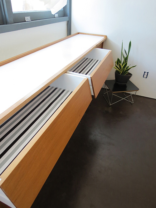
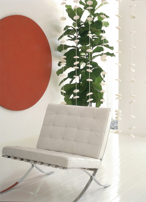
I have always loved the look of mid-century furniture with a combination of wood and some painted or laminated surfaces. If it’s good enough for George Nelson it’s good enough for me. I found a few pictures as examples…
Okay.. you can see where I”m going with that idea…
So I Photoshopped the sliders and that just looked sort of strange so I also added white to the drawers on top. Maybe that’s even more weird. I DON’T KNOW!!!
So at this point I’m not sure where to go with it. Any suggestions would help. I’m sort of leaning toward all wood.. but I keep going back. So the question remains..
All wood?
Painted sliders?
Painted sliders and drawers?
I’m excited to get done with this and I’m really tired of moving so slow with my projects. I want to kick some serious butt this weekend. So thank you for any and all honest opinions!
-Stacey


I might be confused. Is the idea that if you paint the sliders, then there isn’t as much wood next to the new panel, so the panel won’t have to match as perfectly? I think that’s what you’re saying, but there’s still trim around the panel that would have to be matched, right?
If the rest of the doors and drawers are inset inside the piece’s framing, then I would try to make that new panel inset as well, if possible. Otherwise it’s going to look a little off regardless of whether the stain matches. It looks like there’s something on the top of that open section that might prevent you from doing an inset panel, but maybe that can be dealt with. And maybe you plan to recess the panel but just can’t represent it that way in Photoshop.
Also, if you take a section of your old wood into a good paint/stain dealer, they can match it for you on the new wood. So I wouldn’t worry too much about not being able to get the right match.
Finally, I like the idea of painting just the sliding panels. It looks modern and fresh. I would not paint the drawers as well. It makes that part of the piece feel too disconnected from the rest. That’s just my opinion, and it might look very different in real life as opposed to in photos … so my opinion might not be that valuable. :)
Sorry, I think I’m so confused that I may be confusing you. Thank you so much for taking the time! The only reason we thought about painting would be to use the existing panels that match the overall cabinet on the part that needs to be “filled in” because just that part being painted wouldn’t look right. Then we would paint new panels instead of having to match the stain. I guess that sounds lazy, really. Because I think you’re right. Sherwin Williams has always been helpful with me on matching stains in the store. They helped with my kitchen cabinets. Good idea. I hadn’t thought of getting them to help with that. See, several brains are always better than one. I’m too close to it and I’m not thinking clearly. THANK YOU DANA!
P.S. The panel would be inset to look similar to the depth of the sliders next to it.
I actually really LOVE the look of the incorporated white tones – Probably go all the way with the white (i.e. both sliders and drawers) if you are going to do it though, so that it looks intentional. At least that’s MY vote!
Thank you Carrie! I know everyone’s busy so I really appreciate you weighing in.
Once I paint.. it’s on there, ya know. So this really helps me. I’ve always loved that look too. I “painted” the drawers too because I felt the same way… like it didn’t seem very cohesive with just the sliders. You can see why I need help!
Thanks for the vote! I owe you one.
You’re welcome! Best of luck =)
Cam here, and I agree with Carrie. I’d go all the way with the white, it looks great! Who are we to disagree with George Nelson and his aesthetic :)
That coming from someone who knows a thing or two about a thing or two (especially refinishing furniture) goes a long way. Thank you Cam! It’s neck and neck on the white. What would I do without you guys! Probably just NOT get it done and I’m determined to finish this. Many thanks for helping me! I’m starting to get really “pumped”. YAY!
What a great bit of storage! I would go either for capping the end with wood and keeping the cupboards as original as possible, or paint the sliding doors but leave the drawers as they are. I’m sure whatever you do will look fab!
Thanks Vicki! I know, right…. that was just too much wonderful storage to rip out. I couldn’t even imagine buying a piece of furniture or two or three to replace all that. We had to keep it. That little end piece has just been making me a crazy person. I need a drink! (oh, I’m so dramatic.)
I’m excited that you responded. I really appreciate your good eye. THANK YOU!
Looks like you’re getting lots of good advice, can’t wait to see the finished results!
OH NO, Now the pressure is really on! HA HA! I hope I don’t screw it up. If I do.. it’s all my fault because you and others were so kind to help me. I’m overwhelmed by the kindness of people. Bloggers are the best. It’s such a supportive community. :-)
I love your storage unit..I also like that you’re inspired by the George Nelson pieces because he’s one of my favorite designers.
I agree 100% with modernmaggie. That’s exactly what I was going to suggest!
Thank you, Kim! You guys are the best. I truly value your opinion. Once I see a home like yours, I start to wonder if I’m doing anything right because yours looks so flawless. I’ve screwed many things up in this house making the wrong decisions and I’ve begun to question everything. I feel like I have a team of designers helping me work it out. It’s wonderful support. I’m grateful!! :-)
It’s all trial and error! Don’t beat yourself up! Learning and perfecting is the fun part of the journey (even though it doesn’t always seem like it).
I love the look of all wood but honestly, from personal experience, matching stain is extremely painful and the result is almost always a letdown. If the piece wasn’t right next to the rest it would probably be ok but since the pieces will show a noticable difference. I think the paint option not only looks good but it will save you a lot of time and tears in the process….yes….I have cried haha! But I like the first option of paint on the doors (not the drawer part). I’m a fan (my desk has the paint/wood). Good luck love! I know whatever you choose will turn out awesome!
OH sweet Lindsey… thank you for being there! That is my fear, the thought of not being able to match it just right and feeling like it all looks like crap. I’m way too hard on myself, huh. Thanks, it’s silly to fret… it’s not like I’m saving lives, here.
I do appreciate your personal experience on that subject. I’ve never tried to “match” something that exists already. At least not stain or wood finish. My sweet husband probably realized that I’d be disappointed and that’s probably why he suggested the paint. (bless the man, I’m a pain in the ass!)
Thanks again, I’m feeling better and better,… and much less confused.
He’s pretty smart (don’t tell him I said that) but our men somehow always come up with a creative solution to prevent us from losing our minds and making them miserable. I am just like you….I totally put myself through the ringer haha
Since matching the stain and wood intimidates me, I’d go with the painted sliders. And I’d vote for doing just the sliders – no drawers. One of the things that strikes me about the George Nelson examples you shared is that the white part has a different function than the stained part (i.e. white sliders with stained drawers or white cabinet door with stained sliders.) By going with the white sliders and the stained drawers, you are staying true to that design.
Now to complicate things… instead of capping the end, what about open shelving? Four thin shelves that line-up with the 4 drawers you have on the other side of the sliders. I have limited knowledge on mid-century modern design, so I’m not sure if that’s a good suggestion, but I thought I’d throw it out there.
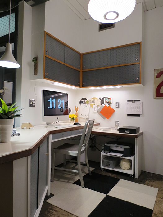
PS. Love the rug and the chair!
Hey Danielle! Okay you definitely have some great points here. Thank you for that! I looked again – you’re so right about the highlighting areas of a certain function… sliding verses pulling. Never thought of it that way… but maybe that’s why it works so well. Obviously I’d be silly to think these amazing designers just did “whatever”. That had to be the intent. hmmmmmm, you’re so smart!
But then you take your smartness and blow the lid off this thing! (LOL)
What about shelves? Book shelves, maybe? We both read A LOT in bed so to have some books and maybe a few pretty things might be cool. I think I’ll go back to photoshop and draw that in. Holy crap, that has my head spinning. I’m sure Tyson could pull that off with a snap! ( we’ll see if Richie strangles me with that idea ) HA! Thank you, friend. :-)
Yay… I seriously can’t wait to see what you come up with. It’s gonna be great either way!
I vote for the sliders to be white as well (not drawer fronts). And I’m not 100% sure about what it looks like behind that cap piece but I think the shelves could be amazing OR just leave it one open cubby with a white back and then put an awesome vase/sculpture/big art books or something in there and make it look intentional. Whatever you pick, it’s gonna look great — look at what awesomeness you have to start with! Can’t wait to see the end resut
The shelves or cubby idea is starting to grow on me. Thanks for the encouragement on that. This project had me sort of down and now I’m getting excited to finish. We have lots of pretty art books so that could be wonderful.
I think at this point we could do just about anything with that end space. It serves no purpose at all… but it might soon! THANKS for your input!
Love the built in! I would go contrast, doors only, adds interest. Whatever you decide I’m sure it will look great, looking forward to the end result!
I hope so. I think with all this help and wonderful suggestions, it will end up looking fine. I’m truly grateful… thank you for weighing in on this “big decision”. (I’m sure I’m making a mountain out of a mole hill!) HA!
OK this doesn’t help your “I just want it done” problem (and may not be possible depending on how the cabinets are built in), but aesthetically I like the idea of making the desk a bit wider and pushing everything else down. Lot more work, but then the cabinets would extend all the way to the wall and you totally eliminate that piece at the end. Also I can’t tell from the photo but it looks like you’ll have to flip the slider sideways to fit over the open space at the end…this would end up a slightly different look from Nelson’s pieces, which showcase the contrast between solid color and wood grain going in the same direction. Just something to consider. Finally, I do like the white sliders but it may look cleaner and more like it was part of the original built-in if the “lip” that extends across the rest of the piece reached to the wall. Maybe the lip with the cubby would do the trick, never know until you try. Good luck and have fun!
I think I understand what you’re suggesting. I’m fairly certain that everything is bolted into the floor at least in a few places so that also presents a problem of moving anything. I’m so scared of tearing it all up. That little desk looking section is actually a vanity. It’s on a hinge and it flips up to reveal a mirror on the inside. I’d have to rebuild that for it to extend further. Wow, this is so cool to think about!
I too started in on the whole wood grain going the wrong way with my husband at dinner tonight. I really can’t have that… it would look weird.
Such creative thinking on this. And don’t worry I’m always “wanting it done” but it never gets that way fast enough. HA HA! For me, it’s more important to take my time and work it out before I do something I’ll regret. So thank you for helping me think it through. You’re too kind!
By the way I like Danielle’s idea about the shelves that mirror the drawers, nice idea.
you’re getting a lot of great suggestions. i LOVE the aesthetic of the white accents. my concern would be the size of your piece, which is much larger than the examples you show, so i would just be careful it doesn’t look like “add-on’s” or “fix-its”. however, my husband agrees that matching stains is a beeyotch. given that, i would do the sliding doors white and keep the drawers wood, that way it looks more like an accent and less like a replacement. my eye goes straight toward the white additions if it’s all white. keep our eyes on that stellar eames molded rocker! ;)
Thank you for that. I agree with you… the more I look at it, the more it just looks like maybe it’s a “fix-it” lazy solution. The examples were all small, moveable pieces of “furniture” so that does make it look different. Good eye! I hate to say it but I think I’m going to try and match the stain. If I can’t then I’ll trash that end piece and move to plan “b”. (sigh) Thankfully I’m armed with all kinds of great ideas thanks to people like you who pitched in to help. THANKS!
I love the two tone look. It modernizes it a bit in my opinion. I think a lacquered white slider would look great (leave the drawers as is) and then use the wood to do the end cabinet.
Thank you Amanda! That seems to be the most liked option. When I look at the one with the white drawers I giggle because it looks like a dishwasher in the middle of the cabinet. (lol) Now I have to get off my booty and DO IT! Ha Ha! Thanks for the support!
One more vote for the white painted sliders. I tried to think of another color to consider other than white, but I think white is the way to go (a just-a-hint-of creamy white – kind of like, it used to be stark white but time has aged me a bit).
Thanks Kelly! I agree with the shade idea. I also photoshopped one gray and one off white and tried different colors, which looked cool… but probably not the best solution long term. My husband loves the idea of different colors. I have to decide by the end of today because I’m ready to JUST DO IT! Thanks for the advice. I appreciate it more than you know!
Indecision is the worst, and you have to feel good about the direction you go… if you aren’t able to make a decision, maybe you’re just not ready. I KNOW the feeling of wanting to be done. And painting does seem like a great, creative solution to the problem. But if the decision gives you anxiety, maybe you need more time. Sometimes these things clarify when you stop thinking about them…
You can always go for a camouflage look—put a giant plant in front of it until your design path is revealed… Whatever you end up doing will look great. Really, it’s a great space, and the cabinet situation will be a small detail in a room that has lots of interesting aesthetics.
As an aside? Husbands should be prohibited from saying, “whatever you want is fine,” unless we already know exactly what we want.
You’re so sweet, Victoria. Thanks for that. I’m really hard on myself in terms of how fast things get done.
Funny you said the thing about the plant because I had actually thought about that. Just kinda “hiding it” until I can stop being a psycho!
As far as my husband… (laughing)… I think he always assumes I know exactly what I want, already. (and usually he’s right!)
Bless his heart, he just wants me to be happy. It’s wonderful and maddening. HA! :-)
I think the all white addition is a great way to modernize such a classic piece. Good luck and I can’t wait to see the after pics!
I really like the white sliders as well. I also saw sliders on a similar colored wood covered in grass cloth: http://1.bp.blogspot.com/-BQYFgW1WafY/Tkq14zXa4-I/AAAAAAAADZw/p4MAa45NLD0/s1600/Paul-McCobb-Planner-Cabinet-ChristopherAnthonyDibs.jpg
I was even thinking wallpaper on the sliders if you want to change it up completely. But the white is a good bet either way. It does really look like a George Nelson piece.
Thank you so much for looking and I totally agree with you about the wallpaper. I’ve seen that done before and it’s so gorgeous. I’m up for anything but my husband is about to kill me if I don’t decide. I’m working on it this week and hope to have some sort of “reveal” by the weekend. Fingers crossed!
Thank you also for following! With your experience I could definitely use any and all suggestions. I’m so grateful.