WARNING: Dirty Word Alert! There is one… but it’s relevant.
In the past year I have really gotten into the idea of digital magazines. Subscribing to so many paper publications I inevitably end up with way too many… and then feel guilty about throwing them out. I always try to purge and go through all these beautiful magazines and get them to a recycling center. Technology has really helped me with my ongoing battle and guilt of buying and then throwing away. I’m really trying to think more about what gets thrown into a landfill and what I can do to keep stuff out.
There are so many magazines now that you can get for your iPads, computers, etc. and many of them are FREE! Which never hurts. Over the last year I have enjoyed several and have my favorites. I found this magazine from another blogger and was so grateful. Sometimes you just don’t have the time to surf through everything so I thought I’d share it with you and pass it along to some of you who might enjoy a beautiful, FREE, and always inspiring magazine called EST. It’s “global living with an Australian twist”
This issue was just delivered to my inbox today. They are celebrating their first year of publishing and the issue is really lovely. You can subscribe or just spend a little time looking through HERE.
The issues usually feature artists, photographers, designers, handmade goods and the beautiful homes these very creative and talented people get to live in. They’re really inspiring. The picture above and below are of Graham Moss’ lovely New York home. (sigh) He’s a creative consultant but what I like is….. he’s a guy who likes to renovate. His home really appealed to me.
I love the plethora of art on that wall (above). The way it looks collected, varied, and unique. Hung so perfectly and well thought out… yet you almost wonder if he just randomly went for it and started nailing. And that George Nelson clock on the wall ain’t too shabby either. I would LOVE to have one of those. (dream on!)
I’m obsessed with placing decorative items under glass, so I love how he did this in the picture below. I don’t know. I can’t really imagine living in a place like this… but it’s sure fun to look.
This was my attempt to put something under glass…. It’s Richie as a young boy with his father. Richie found that glass dome at an estate sale for .50 cents so I snagged it. Somehow it never quite turns out as pretty as the magazines.. but it was fun anyway.
I like the fact that the mag features independent designers and their goods and many of the pages are interactive (which makes sense). If you see a featured item, you can click on it and you’re linked to the artist or retailer online. Very convenient.
Ummmm, yes, I’ll take one of each, please! That Herman Miller wire chair in leather leaves me speechless. And that’s pretty tough to do. HA! The brass lamp has a bit of an industrial look to it, doesn’t it. I love the pulley system on that.
Anyway, it’s fun to look through, get inspired, read about creative people and their spaces, as well as learn about good recipes, places to travel, great blogs and websites, and just really pretty stuff in general.
It was also great to see one of my favorite blogs listed in the magazine as it makes me laugh out loud every time I visit. If you’re into modern design, you know how crazy some of these very pristine, very staged and perfect spaces with their amazing “I could never afford that” decor is all over the internet. It’s fun to look at but REALLY? REALLY?
So fuck those perfectly put together spaces!! Hey.. they said it, not me! The whole idea behind it is to to remind us not to take it all so seriously. It’s just a damn table after all.
It makes me giggle every time. Visit the tumblr site HERE If you’re offended by the word fuck… then it might not be for you. :-) I personally dig it.
Hope you had a good weekend. We made some progress on various projects but more on that later. Have fun looking through the magazine!


Thanks for the ” heads up” on EST , Stacey. I am definitely going to subscribe.
Until recently I had never thought of Australia as a place to turn to for the latest news in design. In fact, I really thought of it in a negative way when it comes to design. This may be the influence of the Australian movies I’ve seen.
Anyway, when we bought our condo which had been remodeled in a very modern style, I immediately headed to Barnes and Noble for magazines to get ideas . The first one I got was called ” HOUSES, Australian Residential Architecture and Design” .
“Houses” is full of some far out architecture and beautiful , sleek furnishings and fixtures
The Tree House consists of two pavilions wrapped in custom- designed , perforated steel screens. The perforations are diamond shaped and scattered randomly. They look like leaves of a tree and they create all sorts of interesting shadows, as well as providing shade.
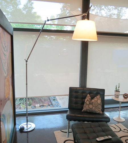
AND, “HOUSES” is where I first saw the Archimede Tolomeo floor lamp, for which
( with encouragement from Stacey) I am now saving my $$.
So, that’s my Australian design story , and I’m stickin’ to it and using my “Houses”
magazine all the time for ideas.
PS – I am in favor of less paper around . We subscribe to four newspapers which has us constantly running to recycling.
Oh good! I’m glad you enjoyed it. I normally don’t post stuff like this but it’s one of those quick little reads that always has lovely pictures, places, and interesting people. I think those Aussies have great style! I was just at B&N Saturday… I should have looked through that Houses mag. I’ll go back for sure. That Tree House sounds amazing. Okay… you’ve got me intrigued, I’m there. Thanks Polly!
Look for Tree House by Steendyk , if you are interested in seeing a pic of that house.
Oh man that’s funny!! I’m the same way with magazines – I honestly rarely read them after the first day, then I try to find a space to make it organized but still visibly accessible so I don’t forget about it. Going to head over and subscribe for my computer. Thanks for the tip.
ME TOO!! A day or two max and then… well, I always think I’ll go back and look at them and before I know it they’re taking over the house! The digital stuff is fun. They’re putting out such lovely content that I think they’re worth supporting.
Thanks so much for posting about this magazine, just been looking through it when I should be working – I love a free read! Your house is so lovely also, looks like you’ve worked very hard doing it up.
Hey Vicki, thanks for looking. The mag is a good little “waste of time”. I think they do a good job putting it together. Our house is …. is… I don’t know …. KILLING US! But thanks for the sweet comment. Yours is pretty awesome too. I have a thing for exposed brick. You guys are doing it up right!
Nice! I’ll have to check these out! Thanks for sharing Stacey!
“to remind us not to take it all so seriously”…now that’s good advice. I hate to admit it but when I got out on my own, I had this whole balanced symetrical thing going…you just had to have two of everything and it all had to match. Yikes! That kind of thinking will make someone crazy! Three cheers for being different and for having an assortment of items that look somehow like they belong together!
By the way, I really like your “under glass” creation. I think what made it work so well in the photo that inspired you is that there are multiple “under glass” creations, and they all have a similar color palette. You’ve got a great color palette going with the black and white photo and the silvery metal…they work great together just like the two kinds of wood do. I’d just suggest finding a few more similar 50 cent glass items to use, you’d get that multiple effect going, and you would “Wow” yourself!
YES! I think multiples would be better. That probably is why I’m drawn to the look. I have my husband on the look out for more glass domes but get this… he showed up with one that is about 3 feet tall. It’s huge and weights a TON. Don’t know what the heck I’ll do with it.. but it’s pretty cool. HA HA!
That is seriously cool!!
Thanks so much for sharing this, Stacey! I’m always on the lookout for great digital magazines..
I love home decorating magazines and unfortunately the ones I prefer are foreign and expensive. Elle Decoration is my favorite, and I also really enjoy some Australian magazines. I like to save them for when I can just sit back, relax and enjoy!
I also have to admit that I get a kick out of FYNCT!
Some of them really ARE expensive. I have to control myself. I have always enjoyed Elle and a follower recommended Houses (Australian). The one I ALWAYS renew is Dwell. I’m a sucker for pretty interiors…one reason why I love YOUR blog. Some of your pictures look like they came out of a magazine.
I love that orange tote. However, it would allow me to carry around even more unnecessary junk…
It’s a great bag! Buying a bag online is always hard for me. Looks are deceiving and they usually end up to be GIANT! Like you said… bigger bag, more crap! It is gorgeous though.
Your glass dome is beautiful! So simple, yet so lovely and sentimental. I’m not really crafty, but you have inspired me to try and emulate this.
How nice. Thank you. I would love to find more and give it another try. I think groups of them look pretty.
I’m not a crafter either… I just pretend to be and wish I was! HA! I need an extra 6 hours (at least) in my day. Don’t we ALL! YES, try it. I would love to see someone else’s creative take.
I love what you did with your dome globe. It’s wonderful. I’ve found Pinterest to be incredibly useful in terms of seeing well-designed rooms. It’s a lot easier to pin something I see than to clip a page from a magazine.
Thanks Dana. It was a feeble attempt but I love that picture of my husband with his father. Old black and white photos tug at my heart! Pinterest is crazy! I could get lost in that for days.
Reblogged this on renovestormama and commented:
I love the glass dome she made. I’m not crafty and really not into having a lot of “stuff” on our shelves, but I would love to make one of my dad and include his old watch. Since he passed away, it would be a sweet little memory holder. Now to find a glass dome…